The following is written by my friend Barnesy, lightly trimmed for length. When he talks about design systems, I listen. You should too.
It promises consistency and delivers drift.
One button in Figma. Another in React. A third in native. They line up on day one and start diverging the moment someone ships a “small” change. Nobody meant to break it. Nobody noticed until QA. By then it’s already rationalized as close enough.
This isn’t a tooling failure. It’s a language failure.
Numbers Aren’t Meaning
Open any Tailwind project that’s been alive for more than six months:
<div class="px-6 py-4 rounded-lg border border-gray-200 bg-white shadow-sm">Looks disciplined. Feels systematic. Is neither.
px-6 is 1.5rem until someone changes the base font size. rounded-lg is 0.5rem until someone touches the config. border-gray-200 is a color that only exists inside Tailwind’s head. Every class is a number wearing a semantic costume. You’re still designing in pixels. You’ve just buried them under indirection.
Hand the same design to a mobile developer:
<Border Padding="24,16" CornerRadius="8"
        BorderThickness="1" BorderBrush="#E5E7EB"
        BackgroundColor="White">
Same card. Same intent. Completely different language. Now change the padding from 24 to 20. One platform updates, another doesn’t, the third rounds it differently because touch targets. The design system becomes a suggestion.
Everyone Solved Half the Problem
Smart people have been circling this for years.
Brent Jackson built Styled System, then Theme UI, then the System UI spec. Design should be constrained scales, not arbitrary values. space[3] is 16 everywhere. Chakra adopted it. It worked. It also stalled. Stayed web-only.
Mark Dalgleish and the team at SEEK built Braid. T-shirt sizes instead of numbers. <Box padding="large" gap="small">. No numbers. Explicitly rejected utility classes. Runs a major Australian job platform in production. Proves the model scales. Also one company, one platform, one codebase.
Radix Themes cleaned things up with a bounded numeric scale: <Button size="3">. Fewer footguns. Still numbers. Still React-only.
— BarnesyEvery one of these systems solved the problem for exactly one platform. A Braid developer and a Radix developer cannot describe the same button to each other. A web developer and an iOS developer certainly cannot.
The W3C Design Tokens Community Group is standardizing token formats. Amazon’s Style Dictionary turns JSON into CSS variables, XAML resources, and Swift constants. The plumbing is improving. But plumbing is not language. A pipe that delivers water does not teach you what to cook.
What If Design Had a Spoken Language?
Describe a component once, in a sentence. Have it resolve unambiguously everywhere.
A chrome outline card, pad lg, radius lg, shadow sm. Inside a vstack, gap md. Header has a heading xl bold. Body has three info rows size sm. Footer has a destructive ghost button and a primary solid button, both size md.
Every word maps to one design decision. chrome is a color role. outline is an emphasis level. pad lg is a spacing token. destructive ghost button is tone + emphasis. size md is physical scale.
No pixels. No platform. No ambiguity. The sentence is the artifact.
The Three Layers
Three layers, each building on the one below.
Color: Four roles (primary, secondary, accent, chrome) and three semantic tones (success, destructive, warning). Each gets five luminance steps. That’s 35 tokens. Enough for every surface in any application. primary-dark becomes a CSS variable, a XAML resource, or a Figma variable. Same name. Same intent.
Space: One scale, seven steps: xs through 3xl. Used everywhere: padding, gap, radius, border width, font size, shadow depth, control height, icon size. The numbers differ per platform. The words do not. A mobile button needs a larger hit area than a desktop button. Both are size lg.
Patterns: Around thirty patterns across six categories (container, action, input, navigation, content, feedback). Each composes from four orthogonal dimensions: tone, size, emphasis, and shape. primary solid button size lg. chrome ghost button size sm. These resolve mechanically on any platform.
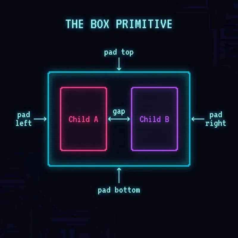
Everything collapses to one primitive: the box.
Four layout modes: vertical stack, horizontal stack, horizontal wrap, overlay stack. Every box accepts direction, gap, padding, alignment, fill, border, radius, shadow, overflow. All tokens. A screen is a stack of boxes. A card is a decorated box. A button is a box with an action.
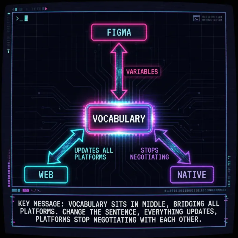
Change the sentence. Everything updates. Platforms stop negotiating with each other.
Where It Gets Interesting
Barnesy’s been building a Figma plugin that reads a design and translates it into this vocabulary. Not pixels, not platform code: the instructional layer in between. The plugin looks at a frame and says “chrome outline card, pad lg, radius xl, border sm” instead of “Frame 482, padding 16, corner radius 12, stroke 1px #E5E7EB”.
Here’s the part he didn’t expect: AI eats this vocabulary alive. Hand an LLM the vocabulary description of a screen and ask it to generate React, XAML, SwiftUI, Flutter: it gets it right. Not approximately right. Right. The error rate drops dramatically compared to handing it a screenshot or a pile of CSS classes, because the vocabulary is unambiguous. There’s no interpretation step. primary solid button size lg has exactly one meaning.
The more you retain the vocabulary through the pipeline (Figma to spec to prompt to code), the fewer translation errors creep in. Every time you drop back to pixels or platform-specific names, you’re introducing ambiguity that compounds.
— BarnesyThe vocabulary isn’t documentation. It’s an intermediate representation. Figma speaks it. AI reads it. Platforms implement it. Nobody hand-translates anything.
What Changes
Conversations change.
Before: Can we make the padding 24? Except mobile needs 20. And the inner section is 16. And the radius is 8 but the button inside is 6.
After: Chrome outline card. Pad 2xl. Inner pad lg. Button radius md.
Before: Three teams redesign the same component and reconcile inconsistencies in QA.
After: The sentence is the spec. If platforms differ, the token value is wrong. Update the tokens, not the code.
This Isn’t New. It’s Just Incomplete.
Constrained scales are proven. Semantic names are proven. Tokens are proven.
What’s been missing is the layer above: a shared vocabulary that spans Figma, web, and native. And a method to get there without burning everything down.
- Tokens are nouns.
- Patterns are verbs.
- The vocabulary is grammar.
You already speak this language informally: make it bigger, tone it down, let it breathe. The work is making it explicit, wiring it to Figma, and letting AI close the last mile.
Stop designing in pixels. Start speaking in language.
Every word above is Barnesy’s, not mine. He’s building the tooling to make this real: a Figma plugin that extracts the vocabulary, and an AI pipeline that turns it into platform code. If this resonates, pay attention to what he ships next.
Related Posts